
Designing a More Intuitive Tumor Localization Experience
-
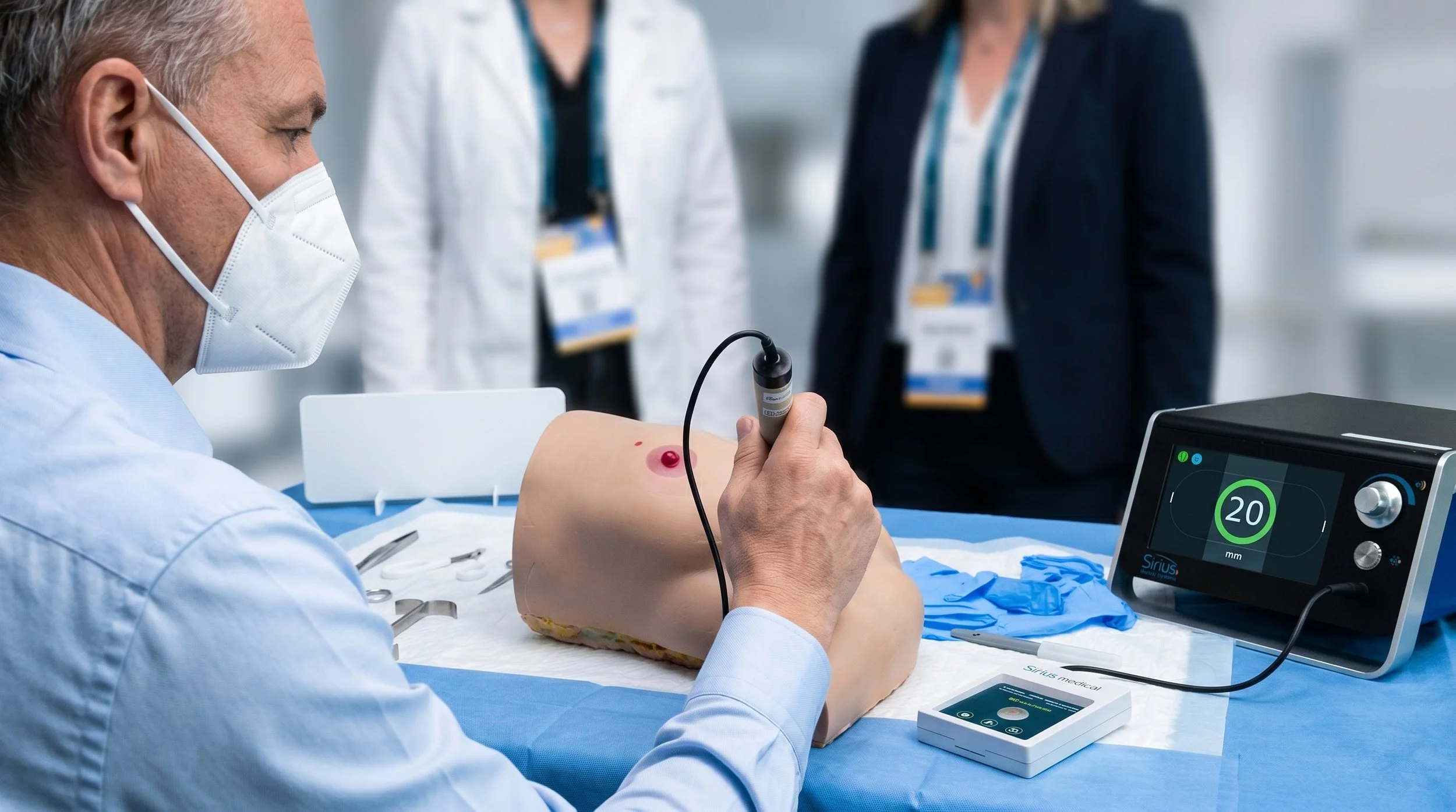
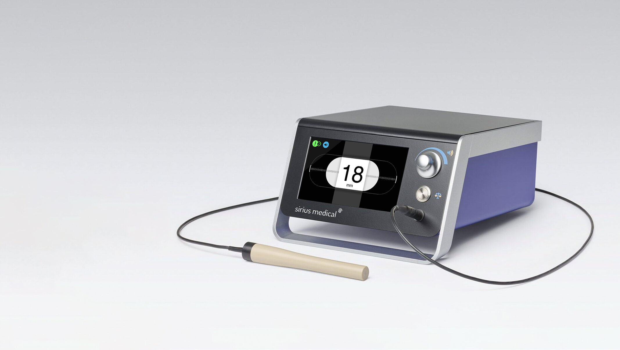
Sirius Pintuition is a tumor localization system developed and commercialized by Sirius Medical, a med-tech company based in the High Tech Campus Eindhoven. As part of its expansion strategy and market differentiation, the company decided to redesign the graphic user interface of the pintuition base system, aiming at delivering more intuitive guidance during surgery.
The UI design enhanced the user experience and usability of the system, making the Sirius Medical pintuition technology a better alternative over competitors.
-
Client: Sirius Medical
Year: 2025
Project Brief
As part of the company’s expansion and market differentiation strategy, Sirius Medical decided to redesign the graphic user interface implemented by their system to guide surgeons during tumor localization procedures.
Bottom-Up Design
Aimed at delivering a more intuitive, accessible, and effective GUI, all its elements were redesigned, including the icons and graphic elements of the interface, their interactive and responsiveness, animations, transitions, and gestures. The design process focused on enhancing visibility, developing a clear graphic design for visual consistency, and optimizing the layout for far distance (3.5 meters) visualization.
Redesigned User Interface
The former interface lacked visual consistency, clear color coding, and design guidelines applied to all its elements.
The design process focused on translating and redesigning all the objects and visual language of the interface for enhanced accessibility and usability.
The resultant interface design emphasizes prominent icons and clear color coding for a more intuitive and agile usability.

Former UI graphic elements

Redesigned UI elements

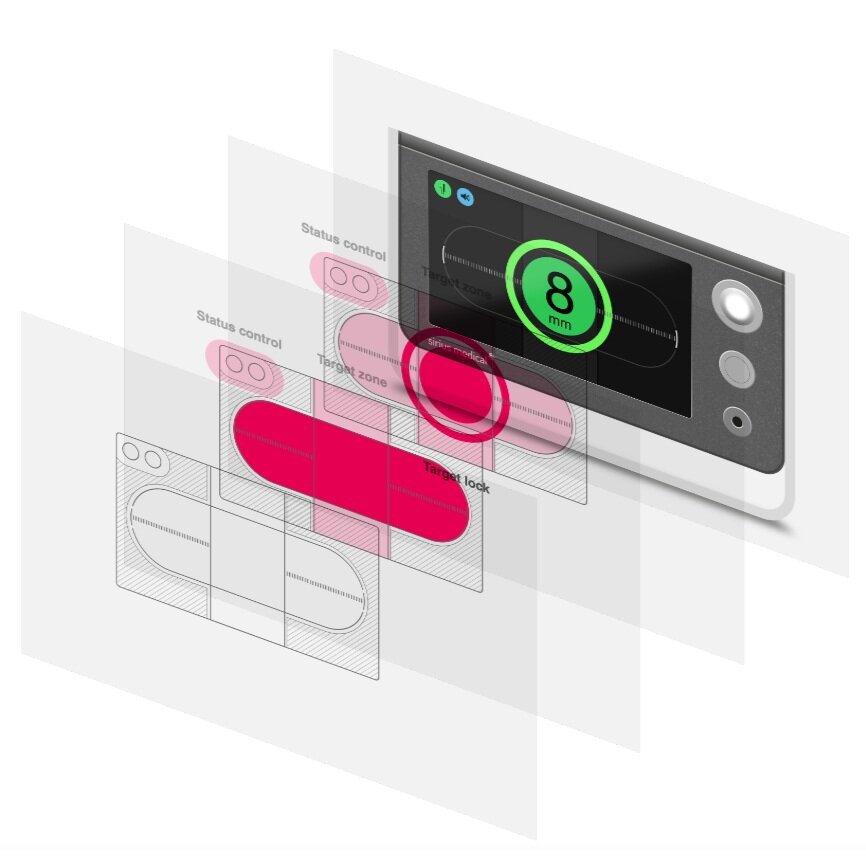
Former target screen

Redesign target screen
UI Layout
Once the visual design of the interface was completed, I focused on defining the layout of the interface, the placement of all the graphic objects and their interaction.
During this process we evaluated the interface from a purely functional perspective. As it is intended to be used in a relatively complex medical procedure, the number of interactions needed to be reduced while the screen size must to be optimized for a fluent and dynamic workflow. I work on reducing the amount of data displayed to the fundamental elements required by the practitioners.


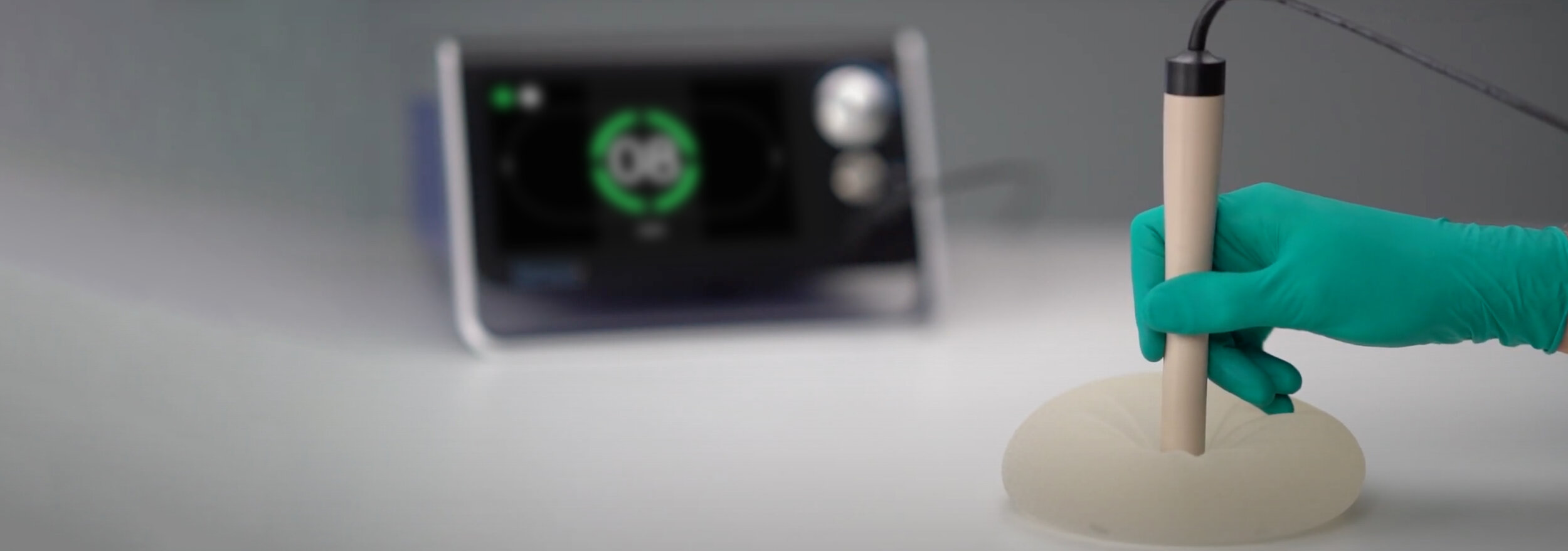
Video credits: Sirius Medical